Concept by She Thrives

theDOWNTOWN SOCIALWedding & Event Venue
Call

Live site, and concept

What changed, and what it is worth.

Every number below was measured against the live site on 1 August 2026. The commands that produce them are printed at the bottom, so anything here can be checked in about a minute.

The home page

The same page, side by side.

Both panels scroll. Real screenshots of both pages, taken in the same browser window on the same day.

The site todaydowntown-social.com
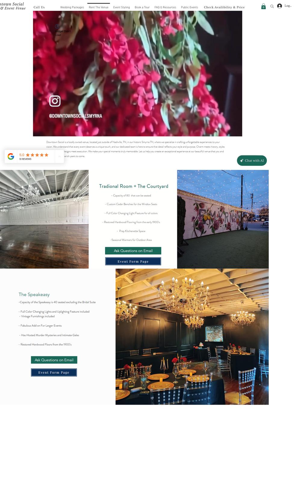
The site today, desktop view
The conceptThis page's home
The concept, desktop view
01

The sentence Google prints under your name.

This is the site's meta description. The same text also fills the og:description and the twitter:description, so it is what appears in a Google result, in a link pasted into a text message, and in every Facebook and Instagram post that links to the venue.

What it says today

https://www.downtown-social.com

Wedding and Event Venue In Smyrna TN Near Nashville | Downtown Social

Smyrna event and wedding venue. This is a Nashville-Area Event and Wedding Space. We specialize in events and weddings that are intimate special. Our Space seperates itself drastically because of our fully custimizable venue with our speakeasy wedding and event space, or traditional room, or event our ourdoor courtyard with beautiful lights and a mural

Quoted exactly as it appears in the page source. Five errors are marked: three misspellings in seperates, custimizable and ourdoor, a missing word in intimate special, and or event our where or even our was meant.

In the concept

https://downtown-social.com

Downtown Social | Wedding and Event Venue in Smyrna, TN near Nashville

A wedding and event venue in historic downtown Smyrna, Tennessee, just outside Nashville. A speakeasy, a traditional room, and a courtyard under string lights.

Short enough that Google prints all of it, and it names the three spaces in the first line a couple ever reads about the venue.

This one is at the top of the list because of who reads it. A couple comparing venues sees this line before a single photograph loads, and a wedding venue is judged on care with details. It is also the cheapest thing on this page to put right: one field, in one place, and the whole thing takes a few minutes.

Everything else

Ordered by what it costs them, heaviest first.

02

The picture that loads when somebody shares you

Today
The social preview image is a 2500 x 3256 pixel portrait JPEG weighing 1.81 MB. Facebook, iMessage and Instagram all crop it to a wide rectangle, so most of that file is thrown away after it downloads.
In the concept
A 1200 x 630 preview, sized to the shape every platform actually crops to, at 186 KB. That is the courtyard mural under the string lights, chosen because it is the one image nobody else in the county has.
What it costs them
Word about a wedding venue travels by people forwarding a link. On a phone with a weak signal the current file is a blank gray box until it finishes loading, and a blank box is what gets forwarded on.
03

The phone site and the desktop site are not showing the same thing

Today
The page builder keeps two separate layouts. Loaded on a phone, the home page carries a Frequently Asked Questions block covering what the rental includes, outside vendors and pricing. Loaded on a laptop at 1440 pixels wide, that block is not on the page at all.
In the concept
One page, one set of content, reflowed for the screen it lands on. The same six questions and the same rates appear on a phone and on a laptop, in the same order.
What it costs them
Couples look at a venue on a phone first and then again on a laptop with someone else in the room. Right now the second look is missing the answers the first one gave, including the one about price.
04

The layout does not fit the screen it is on

Today
In a 1440 pixel browser window the home page lays itself out 1613 pixels wide, so the page scrolls sideways and the wordmark is cut off at the left edge. On a phone the site swaps in a fixed 320 pixel canvas, which a 390 pixel iPhone then stretches to fit.
In the concept
The page measures exactly the width of the window at both sizes, with nothing spilling past the right edge and no sideways scroll. Type and photographs are laid out at the screen's real size rather than enlarged from a smaller one.
What it costs them
A clipped name in the top corner and a sideways scrollbar are the first two things a visitor notices, before they have read a word. On a phone, stretching a 320 pixel design softens every photograph in it.
05

Nineteen near identical pages in one menu

Today
The home page links to 19 internal pages, most of them a separate address for a separate phrase: babyshowersinsmyrna, birthdaypartyvenuesmyrna, bridalshowersinsmyrna, nashvillebacheloretteparty, weddingflowersnearnashville, and so on.
In the concept
One page that answers in order: the three spaces, what they hold, what they cost, and the six questions everybody asks. The ten kinds of event are named in one place instead of nineteen.
What it costs them
Somebody who wants a price and a tour has to read a wall of near identical options and guess which one they belong in. Every extra guess is a chance to close the tab.
06

A spelling error inside the main button

Today
The call to action in the desktop header reads Check Availibility & Price, and it is in the menu on all fourteen pages checked. The phone version of the same button reads Check Availability & Request Pricing, spelled correctly, which is the two layouts coming apart again.
In the concept
The rates are printed on the page itself, so the most common question is answered before anybody has to press anything at all.
What it costs them
A typo in body copy is easy to miss. A typo inside the button someone is about to press is the last thing they read before they decide.
07

Prices exist, but nobody finds them

Today
Rates are published, and they are good ones. They sit part way down a page called downtownsocialeventvenue, below several hundred words about room layout. On the home page the answer to What is the Pricing? is a list of seven links to click instead.
In the concept
A pricing block on the home page carrying the same published figures: the Saturday minimums, the hourly Sunday and weekday rates, the Speakeasy wedding package, and the business rates.
What it costs them
Price is the first question and the one people are shyest about asking. A venue that answers it in public gets the call from people who have already decided they can afford it.
08

Editing placeholder still live on a page

Today
The business rentals page still carries the page builder's sample text: I'm a paragraph. Click here to add your own text and edit me. It's easy. It sits directly under the heading, in front of the pricing.
In the concept
The weekday and recurring rates are written out with the rest of the pricing, alongside the wedding and party rates, in the same table.
What it costs them
This is the page a business owner lands on when they are deciding whether to trust the venue with a company party.
09

No headline in the page for a search engine to read

Today
The home page ships with no heading element at all, at either screen size. The wordmark is drawn in, so a crawler arriving at the page finds the title tag and nothing beneath it.
In the concept
One heading per page, plus structured data describing the venue, its address, its phone number and its capacity, so a listing can carry that detail into a search result.
What it costs them
Search engines and the AI assistants people now ask for recommendations both read the same markup. Neither can quote a headline that is not there.
10

The weight of the home page itself

Today
The home page document is 1.18 MB of HTML before a single photograph is requested. That is the page builder writing the whole site's machinery into every page.
In the concept
The same page, measured the same way, is 134 KB. Photographs load as the visitor scrolls to them rather than all at once.
What it costs them
Most people find a venue on a phone, often on the road. The first thing they experience of the building is how long it takes to appear.

What is already right, and worth saying plainly.

  • The product is genuinely distinctive

    A speakeasy, a traditional room and a turfed courtyard with a painted mural, in one 1890s building. Nothing in the concept invents a selling point, because there was no need to.

  • The social tags are already in place

    Open Graph and Twitter card tags are present and correctly formed. The wiring works. It is the words and the image inside it that need changing.

  • The photography is real

    Every photograph in this concept came from their own site and their own social accounts. Nothing was substituted with stock.

  • The details are all written down

    Capacities, inclusions, hourly rates, the alcohol policy, the parking, the 2am music cutoff. All of it was already published. It is a matter of where it sits.

How this was measured

Check any of it yourself.

Everything above came from the live page on 1 August 2026, with nothing beyond curl and a browser. Nothing was estimated.

# the three misspellings, in the meta description
curl -sL https://www.downtown-social.com/ | grep -oE 'seperates|custimizable|ourdoor'

# the weight of the home page document
curl -sL -o /dev/null -w '%{size_download}\n' https://www.downtown-social.com/

# the weight of the social preview image
curl -sIL "$(curl -sL https://www.downtown-social.com/ \
  | grep -oE 'og:image" content="[^"]+' | cut -d'"' -f3)" | grep -i content-length

# how many internal pages the home page links to
curl -sL https://www.downtown-social.com/ \
  | grep -oE 'href="https://www.downtown-social.com/[a-z0-9/-]*"' | sort -u | wc -l

# in the browser console, on the live home page:
document.documentElement.scrollWidth   // 1613, in a 1440 wide window
document.querySelectorAll('h1').length // 0
document.querySelector('meta[name=viewport]').content // width=320, on a phone

Prepared by She Thrives Software Consulting. The live site is at downtown-social.com.